


Exhibition identity for the annual Photo Fair at the Centre of Contemporary Photography.
A conversation between Adam Harding (AH) from CCP, Rhys Gorgol (RG) and Corey James (CJ) from The Company You Keep and Matt Leach (ML) from Australian Design Radio.
The Centre for Contemporary Photography has been around since 1986 and it’s incredibly well respected and it’s a key part of the Australian art and photography scenes. During that time, photography has been through a massive change. Adam — I’m interested in how that’s affected CCP?
Everyone seems to be a photographer today. One of the key things for us is the way we can position the voices of the artists that we work with and talk about the ideas that are embedded in the work so that the artists that are using a lens based practice can be presented and communicated to the largest audience possible. We live in a sea of imagery now, and we’re constantly looking at our phones, we’re on Instagram and we are swimming in a sea of imagery. For us, it’s about when you enter CCP and actually start engaging with the artists whose work is exhibited, you can clearly understand what they’re talking about. We’re positioning and presenting the work in a way that allows it to talk to the broadest audience but also talk to its past and history and allow us to see today in a better light.
It’s almost like you need to create a cone of silence, effectively. All of the distractions melt away. Rhys, The Company You Keep has been working with CCP since 2019; I’m interested in how that relationship started?
The relationship started based on an introduction from a board member. The board is quite a diverse set of people and there were some mutual contacts on the board of CCP. They were looking at doing some new things with Adam coming on board in terms of the brand and the presentation of the organisation. The gallery itself has always had a big footprint within my life. I used to live just across the road from it and it’s almost, in my mind, the perfect epitome of Melbourne, whereby Melbourne bats above its weight. The population shouldn’t really afford the amount of institutions and great shows that happen within the city, and CCP itself is a small specific gallery that’s in the urban fringes of Melbourne with a very significant architectural imprint. It has a very significant curatorial program and a very significant history. This is something that’s quite interesting to us at TCYK and if we can lend our skills to helping articulate that to the broadest population possible as clearly as we can, then we’d love to get on board with it. So, we did.
I understand this was a pro bono work and can you explain a little bit for the audience who may not understand what that means?
Pro bono is essentially a different way to structure an engagement. Rather than it being a fee for service where you’re exchanging monetary value, you’re exchanging services for in-kind or for other benefits. We do that in-kind with CCP — their value set, their proposition and their purpose is something that was incredibly in line with us at the studio. As well as Adam’s vision for the organisation, and the significant connection with the board members and looking at taking the gallery in a really progressive direction.
Adam, a design studio working with photographers — that seems ripe for confrontation.
You would think so and it is really interesting. As Rhys has touched on, CCP is housed in the gallery that was designed by Sean Godsell, and it is essentially a concentric circle where you wind your way around the space. There’s a very strong circular lens-like motif across the entire interior. The ceiling is a perforated material, there are key walls where you walk in and look into the gallery space where that perforated pattern is repeated again and again. So we are presenting the work within a highly designed space, and one that we hope to work with and enhance. CCP does have a long history in employing design, particularly in our publications and across our social media to push the ideas. We think it’s a really great opportunity to open out. We want to start with the artist and have the artist’s voice, but then we want to amplify. We felt that working with TCYK was the best way to really get those ideas out and get the work out in the broadest way possible.
One of the projects you seemed to have had a lot of success with is the 2019 CCP photo fair. First up can you explain to me, Adam — what the purpose of that fair was?
CCP has a really long history. It emerged in the mid 1980s and it was the coming together of the fine artists that used photography. There were four distinct groups of photographers that came together. There were the artists, the journalistic photographers, the commercial photographers and the community based photographers. They lobbied the state government to come together to find a space that would be a place to present and exhibit photography, as well as a resource centre to share technical skill and ideas. I was new to CCP and I really wanted to touch on that history and directly engage with those commercial photographers that we hadn’t seen in the CCP program very often. I was really interested in these photographers that are taking photographs every day, they are working to a brief, they’re attempting to communicate someone else’s visions. And I was really interested to see the photographs they took for themselves; what drove them to pick up the camera outside of their work hours or to continue their passion for photography? We wanted an opportunity to celebrate their practice and bring them together. CCP had a history of presenting a fundraising exhibition where we would go and ask each of the artists that had exhibited in the past to give us an artwork that we could sell that would then support CCP financially. We wanted to change the way that we did that, and we wanted to not necessarily keep going back to and asking the same community to support us but to touch all of the communities of CCP and ask for their support. It was an opportunity — what we were attempting to do is build a commercial marketplace for the work that commercial photographers were already making and to really highlight them; to talk about the skill and passion they bring to their commercial photography.
Rhys, I’d love to understand what the brief was and the outcome you were hoping to achieve?
The brief that Adam came to us with asked again, as an organisation, how do we raise money to support and put on the shows and employ the people that are required to make it run? An alternate take on doing that is to essentially lease out the walls. The infrastructure or the physical footprint of the building was essentially then the component that was offered to allow these photographers to show their works, which is an alternate way of what’s done in a salon, where there is just a general submission and a salon hang. This is a bigger version of that where each individual artist takes a portion of the building. The first part of the brief is the EOI component. Before it even gets off the ground, before you have the artists that come on board and then you’re talking to the end consumer who might want to come to show, you have to drive interest with the artist space. They need to come on board, see the value and opt in to that. When we were briefing the design team, and Corey is taking the lead on that — the question was how does this brand have almost two stages of its life cycle and have the ability to evolve through that? Prior to having the artists on board where you aren’t able to leverage their profile, or their name, or have that kind of content, how do you create a graphic identity that rolls across through these different mediums? It’s successful before you have the content and it’s successful after you have the content, whilst also wrapping up the concept of the whole thing for both parties.
When you get a project like this that has a brand already existing, is it tempting to create a new brand? Or are you trying to link them together?
Always trying to link them together. CCP has a long history but again it’s designed for the arts, it’s a very subtle and nuanced business. Because you have to be sensitive around the work that you’re presenting; it’s not necessarily about the design work, the design is there to support and communicate effectively the intention of the programming, of the curatorial aspect of things as well as the inherent content, or the art. When we’re thinking about creating these “sub-identities” around specific events, we want to ensure that it builds on the existing brand language rather than erodes it and creates something completely new and different. It’s alluring as a designer to create something new, to not have something in the past but to create a new type of graphic language or play with palette or play with form. A sub-identity affords that, but its role within the broader context of the CCP brand lifecycle was to communicate effectively what’s unique about this show, at the same time connecting back to the parent brand and reinforcing the thinking around that. That’s what we’ve done typographically.
One of the strengths of working with TCYK on the CCP Photo Fair was actually the work we had already done. TCYK had a deep look at how we were using our branding, how we were communicating about ourselves, our own understanding of what CCP was. The Photo Fair was a completely untried, untested brand-new idea, and what gave us the faith to pursue that idea and to launch into doing the hours and hours of work to develop something from scratch, was the engagement we had with TCYK. They had looked at our brand well enough, they helped us conceptualise the project in a really strong way because they understood us well. They could take what was quite a simple idea that the CCP board had and actually say, yep. They helped us with the mechanics of how it comes together and how it connects into that larger industry, that of course TCYK are part of.
Corey, when you get a brief like this, because it’s pretty complex and there’s lots of moving parts, I’m interested in how you begin?
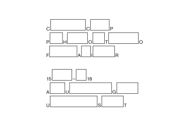
There’s a couple of different aspects to this job. One of them being that we’re already working under an existing identity. Part of what we did with this project was use it as a vehicle to further define the CCP identity as well as establish the separate photo fair identity. The other aspect was the fact that this is a group show. So you’re working with myriad different artworks and different personalities and visuals. How do you come up with something that is representative of that; should you be doing that? If it was working for a singular artist, you would have more of a theme to work off. What we ended up doing was actually looking at the physical space, going back to the architecture and working this concept from the ground up. We knew that there was an aspect to the show where the walls were actually for sale; also each artist was afforded a different wall within the gallery space. There were 10 to 13 different walls — we took that as the jumping off point. That was our one tangible thing; we knew there would be variations of wall sizes. The works were going to go on these walls; as a viewer you experience the work going through the galleries, looking at the walls and the artworks. That was an interesting thing that stood out in this whole project scope. From there we tried to come up with a system where we just based it on the dimensions of the specific walls, and came up with an entire suite of these little glyphs of white wall space. Originally, we were trying to think of how we can use this vernacular in an interesting way, and it ended up being so by splicing it in between typography. Taking simple messaging, taking names, we could develop a language that was interesting and a little bit strange but didn’t veer too much from the original identity. We had the typeface there that already existed, so we used that and by taking this idea of the white wall we were able to tweak ordinary messaging or ordinary naming; give this photo fair a completely different spin.
You talked about that idea of the system; of setting up a system, a template for everything to work within. You can see that quite easily across all the collateral that was created, the posters and the brochures — that’s obviously very intentional, isn’t it?
The other part of having this system that was purely messaging driven and type driven — what we’re doing is, wherever we have a message, we have the ability to create a unique visual. Because originally when we came away with the idea of using the actual wall dimensions like a glyph set, we found that it was too restrictive in the end. Having to always use the one wall that was 3×10 and another wall that was 3×3, we loosened our grip on that a little bit and just thought, let’s just use fluctuating wall sizes in general, because we’re going to intersperse this into typography. We knew that in the marketing and communications around any kind of artistic exhibition or fair, you always have an image to work with, you always have messaging — how do you inject a distinctive identity in that? Having these walls that were spliced in between the letters gave us the ability to flex through lots of different dimensions; it could scale up really legibly, it could sit on white, it could sit on an image and it is always interesting and recognisable. The idea of developing that rhythm and getting this contrast between the white walls and the image was a key ingredient in making something very distinctive.
Corey, you talk about the glyphs and on the posters, essentially white boxes. There seems a real pacing there where they’re actually situated. Can you tell me more about that?
One of the reasons that we decided to do it in this way, in this fluctuating dimension was to mimic the pacing of someone walking through a gallery. The messaging itself is not super easy to read, it’s not something you can just glance at driving past in a car and understand. You have to go up to the poster and look at it and each letter, you have to jump across a light box to get to the next letter. For us that was similar to the experience of being at a gallery and spending time with each work, and you walk to the next one and you spend a little bit more time. That was a nice little nod to the gallery experience. Something that’s super buried in that concept, but for us, we always try to look for any place that we can inject meaning like that, and ask how we can further cement and be sure of this concept.
With the system, when we came back to this idea of the identity being essentially a typographic expression, it allows us to then have something that’s quite distinct visually, but also allows us to use it rather sparingly at times or rather loud at times. Thinking through the various items or interfaces in which this exhibition identity is going to express — from social media, to wall didactics, to street posters. There’s going to be times when it does interplay with the actual artwork and there’s going to be times when it doesn’t interplay at all. So how does it traverse across these things? Where it has the ability to remain strong enough in isolation, but not overwhelm or overpower when it comes in contact with these other parts.
You mentioned the street posters there and I felt like that was one of the standouts of the project. They really capture the eye, and they force you to stop and really take notice of the image and also the message that’s being given. I was very interested, from your point of view, Corey, working with photography, great photography — does that make your job easier or harder?
Definitely ideal to work with great photography. But it’s an interesting point and because it is a group show, again — what elements do you work with? What can you pull out, what can you highlight? We didn’t want to give the show away in our communications. We didn’t want to take the photos that are inside the gallery and put them on posters outside the gallery. So the direction we ended up going in was something like an obscuring of the images or allured to the quality of the photograph, and a play with contrast and a covering up of something that was really interesting and distinctive underneath, with this messaging with this esoteric identity on top of it. On one hand you can see that these images have intention, and they have meaning, and they’re of quality. We’re just hinting at something and the idea is that it should elicit a response, and should be able to intrigue someone to go in and experience the show.
It almost comes back to what Adam was talking about before — around the role and relationship between photography and design. And it was something we all talked about throughout this project, because at times the typography is quite dominant over the top of the photographic imagery, and that was intentional as Corey mentioned. There’s almost these two paths you can walk down. One being the presentation and one being the representation of something, and so we took the role of representation here rather than presentation. Presentation is a more conventional graphic design model for the arts, whereby it’s very subdued, it’s very restrained and it’s, “here is the presentation of the artwork”. It’s very precious in the way it’s being presented to someone. Our version here with the Photo Fair was about representation and as Corey alludes to, it’s more about enticing and alluring people into being inquisitive about something, to look again at something. That was the role of these posters and that was the role of the design here. So that when they get into the gallery they get to experience it, rather than having felt that experience before they even get into it.
A lot of the time graphic design gets in the way of itself and gets in the way of content, and we were very aware that we didn’t want to do that. That partly came under the fact that again, CCP had this identity. We knew from the website what the tone of voice was and what elements we could work with. But it was really deliberate not to put too much of this exterior personality on top of what CCP was already doing and what the show was meant to be doing, and so that’s why we were able to pull from these existing assets and come up with another little element to sprinkle on top.
This is one of the key successes of the branding for the CCP Photo Fair. It is one of the hardest conversations ever to have with the artist saying, your photo is fantastic, but we’re just going to make it fit our marketing materials, and we’re going to crop it like that, and we’re going to stick it here, and then the idea that we’re going to overlay blank space and graphic details over the top of their pictures are really, really hard questions. No, no, no, it’s my photography, it’s my photograph — it’s like we’re tattooing their face. It’s really hard, it can sometimes be really confronting. But it was in the quality of the work that TCYK did and the fact that we could work together to actually have that branding and that language developed alongside us bringing the artists together. A lot of this design was done before we even knew who the 9 photographers were or what the 9 photographs looked like. TCYK were able to develop this very strong identity so that when we actually did bring the photographers together with it, it worked really well. It had its inherent strength, and we were able to really get the photographers over the line because we could share the uniqueness of their presentation across the 9. This was built into the design framework which allowed them to be individually recognised, then the 9 photographers and the 9 posters looked like this amazing set. And for me that was their real strength.
It’s definitely one of my favourite parts of working with Adam, these dialogues around the role of design in representation versus presentation. As Corey mentions and as Adam mentions, decisions here were very intentional. In terms of how we’re expressing things and why we’re choosing to represent not present. So everything is done in a very respectful manner about the content. It’s not about the self-indulgence of design ornamentation, it’s stepping back and thinking: what is the role of design within this specific communication here? And then how does that interplay or have a relationship with the content? And how do we navigate that with the content generators? The artists in this instance, the curators and CCP as a brand, and then also with the community in mind too. Because that’s who we’re trying to connect with and that only happens with dialogue and with relationship. They’re some of the funnest conversations to have.
When the artists had seen CCP and we’d got them on board, and we could share with them the way we were going to represent them to the community and market them, essentially one of the things that we were offering them was this umbrella marketing. This was part of the project: we’re going to build the market for you. So, we’re going to communicate out and bring the audience to you. They didn’t have to do that themselves. We had the ability to share all of that material at once as well as sharing the exact layout of their work, where exactly in the gallery it was. We mocked up their presentation, and they could see that they were getting this very pure, very standard CCP exhibition presentation. A majority of the works were hung on a centre line, they were evenly spaced, they were exactly how we presented every other exhibition within the CCP program. To communicate both to the artist at one time; the presentation is this, and then the representation out in the marketplace is this. How they spoke to each other; how we could do it at the same time really enhanced our ability to get the artist over the line.
Adam, final question for you. In hindsight, talk to us about the outcomes?
We were really blown away by the outcome of the fair. We had 4,000 people visit CCP over four days which was out of control. We threw two absolutely amazing parties that I can’t even imagine presenting right at this moment, and the number of people we jammed in the building who were excited to be at CCP. For me, one of the key things was the majority of the people I engaged with — and I said hello to nearly every single person that arrived that weekend — was that they hadn’t been to the CCP for the longest time. But this project and the way we had framed the Fair and communicated about the Fair, meant they had to come. They wanted to see how it changed, they wanted to experience how it was different. It just reminded them about why they originally loved CCP in the first place. It was, “why had we stopped coming? We love this place, we need to come again”. We sold $56,000 worth of artwork — the majority of that money went back to the participating artists. Through that process CCP also generated $46,000 to support the rest of our program. But the key thing for us was that deep and direct engagement with professionals that work in design, advertising, architecture and the way that they saw CCP as a resource or a space for them. Presenting the photographers that they love, presenting work that they really enjoy and the ability for them to actually take that work home. It was really about deep re-engagement with a key community that we need to support CCP.
Director: Rhys Gorgol
Designer: Corey James
Client Service: Brooke Wallington
Photographers: Anita Beaney, George Apostolidis, Isamu Sawa, James Geer, Jo Duck, Kate Ballis, Saskia Wilson, Tom Blachford, Tom Ross
Typeface: Akzidenz Grotesk