


The legend goes, in 1914 William Wadsworth Hodkinson, founder of Paramount Pictures, drew the now infamous studio logo onto a napkin. With 24 movie-stars in the studio stable, his idea was simple; place those stars in an arc above an impressive mountain, add a script typeface for good measure and the rest is history, literally.
Fast forward 100 years and the former headquarters of Paramount Pictures in Sydney is a hotel run by hospitality heavyweights that has an ability to embed guests in the neighbourhood as soon as they check-in. The stars, in any good hotelier’s eyes are the guests. Hodkinson’s stars have been reformed into an architectural elevation of the hotel, squarely focusing the attention at every point on the guest. The reformed logo fosters conversation at check-in, aiding a subconscious flow through the hotel to avoid awkward head shakes when the elevator opens, “is the room to the left or right?”.
Like any star worth their salt, materials, textures and objects continue to inform and give of themselves in ways that reveal purpose, narrative and patina over a stay; a place to wear in, not wear out. Much like its surrounding neighbourhood, a patchwork of colliding streets, demographics and eras that ultimately create something more than the sum of its parts.
“Throughout the hotel, past and present are expertly brought together.” —Vogue
A conversation between Matt Vines (MV) from Matt Vines Consulting, Rhys Gorgol (RG) from The Company You Keep and Matt Leach (ML) from Australian Design Radio.
Matt, I’m interested in your place in this project and understanding how you got involved in the first place.
I got involved in the project originally through one of the three owners, Russell. We were training together in a gym, and would talk about travelling, restaurants, hotels and places we loved and struck up a relationship from there. At the time my background was in quite traditional PR and comms, but I had always stayed at the forefront of the industry as it evolved and began to evolve more rapidly. When I opened my own consultancy, I wanted to completely relook at how that service industry and communications functioned because I started out working with luxury fashion brands; particularly brands within the LVMH portfolio who are master brand builders. But I noticed that there were so many discrepancies between all the brand touch points. My opinion was that for brands to be truly successful in the world we live in today, every one of those touch points had to be aligned in terms of tone, positioning, values. With my consultancy it was never going to be a PR agency or a marketing agency. I wanted to offer a truly holistic consultancy for brands and Russell, Jin and Mark with the hotel were one of my first clients. It was a really exciting opportunity to get involved very early, and rather than retro-fitting a launch strategy or a comms strategy around a finished product, really have a seat at the table, just to offer them strategic counsel around bringing something to life that was so new and didn’t exist in Australia prior to that.
I’m interested in when TCYK was brought into the project.
When I was brought in it was still a long way off construction, and we were doing site visits with hi-vis on; the property had no roof and there wasn’t a lot to see. Russell, Mark and Jin are prolific in terms of their projects, and I knew the standard they would deliver would be amazing. Whilst I regard myself as a brand consultant, I think using the term “brand” is almost daggy with over use and misuse. You say brand to one person, and they think you’re going to design a logo and you say brand to another person, and they have a completely different idea of the service you’re going to deliver. When I talk about the brand work I do, it’s brand identity and brand positioning, but largely through storytelling. What I’m looking at is all the external touch points around that brand. From a storytelling point of view, from narratives, from positioning, from really understanding that brand’s value and its story. I’m not the kind of brand person who’s talking about design, graphics, fonts, colour schemes and wayfinding. With my consultancy, it was all about finding the best people who do specialise in that work. We did a tender process to three of the best Australian studios, and Rhys and TCYK were successful. They really understood the brief and came at it with some very original ideas, and what we wanted from them was ways to really elevate the project. There were already a lot of great ideas; they came at it with ways to take it to the next level.
Tender processes are interesting because they’re not necessarily the organic way we would engage with a project. Where we get our best results is usually through dialogue with the stakeholders to co-create or understand that. However, in this project having known Matt, and having a previous relationship with Russell, Mark and Jin there’s a real understanding of the motivations. The values they see in the world and what they would hope to put out there; that’s a shared value set. When that opportunity came to the studio it was super exciting to have the chance to co-create or collaborate with people who we respect, but also share a similar outlook on brand, experience, hospitality, service and in this case what a hotel could mean to a location and a neighbourhood such as Surry Hills. Our process for our response to that tender centred around trying to capture the inherent identity that already existed in that community and that space. It wasn’t about creating something, it was about trying to represent something. Trying to find the truth of that area and location and space, and allowing that to have a voice, or allowing that to be expressed through an identity or a graphic sensibility.
We’ve spoken a little bit about where the area is situated and that comes with its own history and expectation, but the building also has its own history. I’m interested, Rhys, in how you take that into account when you’re looking at brand and identity?
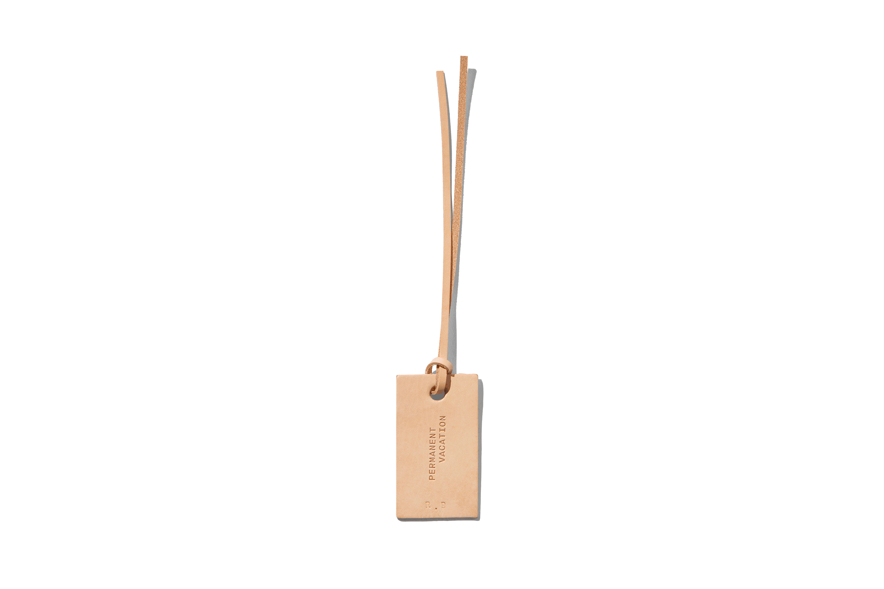
It’s a good question and it’s all about context again. There’s the context of the neighbourhood, the city, the country. In terms of the internal stakeholders of the brand, who are trying to put this thing into the world, but also the market that is going to engage with this proposition. If you move further into that there’s the individual site, and that site has its own context, its own history, its own narrative. In the case of this specific site, the old Paramount Pictures headquarters, specifically with the hotel being where they stored the film archive as an adjunct to that other building, combined with the working title of the hotel and site being Paramount House. The connection to the physical naming of that history and some of the subsites we had previously worked on such as Paramount Coffee Project in the foyer. We had experience working on that with Mark, Russell and Jin. Knowing that there’s already the beginning of a narrative there that is paying homage to the history of the building. When we were thinking about the graphic identity, there’s cues from that Paramount Pictures graphic identity that we wanted to nod to. Not in a way that was to pastiche a style, but more to reference the inherent concept and history that is unique to that sense of site. In terms of what we graphically picked up on, that was the star motif. It’s something that does exist in these subsite identities. Paramount Coffee Project looks at using a star in that motif. And what we chose to explore was essentially the roots of the thinking around the original Paramount Pictures identity. It’s one of those things which has this beautiful naivety to it whereby it was designed by the founder of Paramount Pictures. He had at that point contracted 21 stars or 21 actors in his production company, and they were represented by the stars going around the mountain. It was a very literal description of what he thought was the equity in his business, tying into the tropes of movie stars. When we started thinking about that in relation to the unique proposition of the owners, the stakeholders of the building and the site itself, the cliché in hospitality of ‘the guest is the star’. Utilising the elevation of the building but rearranging or reforming that star motif to be representative of the context of the site allowed us to pay homage to the roots whilst also giving it a new narrative that was authentic and representative of what the new custodians were seeking to do with the site.
Matt, can you tell me a bit more about Paramount House Hotel’s approach to introducing the hotel to market, because I understand it wasn’t your typical approach?
The owners Russell, Jin and Mark are three super intelligent, very successful businessmen, they all have different experiences and world views, and they just wanted to bring the hotel to market a little differently. Jin in particular was very strongly of the opinion that in today’s world particularly with social media where everything moves so quickly and people come into a new space, photograph every inch of the place and share it, there’s no surprise and no delight left in anything. One of his briefs to us was that in the launching of the hotel, from the photography we used to launch it, to the press tools, to the storytelling, that we should strategically omit as much as possible. If Jin had had his way we would have launched it with one photograph and a paragraph because he really did want people to have that sense of discovery. Which is a great brief to work with, because the best briefs come out of having constraints to work around. We worked with Sharyn Cairns on the photography, which was a really good investment, because she’s such an incredible photographer and can fit so much into one photograph. This again really elevated the project just through producing such stunning visuals that allowed that kind of visual storytelling to happen without giving the whole game away. My thinking around the comms for the launch was — obviously, the owners have a background in hospitality, but in cafés, and this was their first hotel. What they do with their cafés is perhaps the real entry level, although they do it flawlessly. But the simple entry level expression of hospitality — here is a beautiful cup of coffee, here is a glass of water — if that’s one of the most simple expressions of hospitality, a hotel is the other end of the spectrum completely. You’re keeping someone and all the belongings they have with them in the world at that point in time safe for the night and offering a good night’s sleep. It was how to communicate that in a way — I hate the expression “on brand,” but it was “on brand” for the owners, for those three guys, because they’re very humble guys and very thoughtful. Everything we did for the hotel’s comms and everything they did for the hotel’s service was put through the filter of under-promise and over-deliver. We didn’t want any hype, we didn’t want any fanfare. It was always just coming back to this, being confident that they’d done something original; the service was there and the design was there. Letting people kind of discover it for themselves.
Rhys, how do you translate that to the identity, for example?
The way in which that thinking informed the identity was really through the nuance and the subtlety. Again, this idea of confidence — it’s not about these very overt, large expressions; it’s about having the belief and the patience to allow small gestures to speak quite loudly. It’s rare that you get a client who has the nuance to understand that, adopt that and follow that kind of process. It’s this as well as the trust again in your viewpoint. The mixture between the intellect and the intuition. There’s the intuition component whereby there’s the sum of your experiences that have formed you to this point and sit subconsciously within you and inform how you respond or react to certain scenarios. Vice versa, there’s the intellect side, there’s the subject expertise; this is your craft that you’ve spent this time honing, and with the team that came together that was there in every single stakeholder. From Matt, to Russell, to Jin, to Mark, to Jeremy, to Bonnie, to everyone who came across this project. Whereby, we’re trusting the intuition of each other as well as trusting the intellect of our subject matter expertise, or the craft that we bring to the project. What that allowed was a confidence to not follow convention. To go — yes, there’s a precedent, things are being done this way, but that doesn’t necessarily mean that’s the only way to do things. That guiding light allowed for something truly unconventional and original to be born and then to resonate with people in the market, or have a chance to do that. From a brand identity perspective, beyond the subtlety of these nuances, it’s finding these core things, and for me, it was really the sense of place. How do we capture the sense of this neighbourhood? One thing that resonated with me, I believe Mark said in the early days, was that they spend an inordinate amount of time travelling, they do that as part of their jobs in terms of sourcing coffee and doing these sorts of things. But when they were looking to open a hotel, they double-downed on that and went on a bit of a world tour of looking at hotels and things. One of the realisations was that you could be in a great hotel and be having a great experience, but you could wake up, and before you open the blinds, you could be in Santiago, or you could be in Kuala Lumpur, or you could be in London, and not really know the difference. This yearning to capture an identity or a sense of place gave it a chance to be unconventional and new, because there was nothing like that in Surry Hills, therefore it had to be unconventional and original.
I’m interested in the digital sense, particularly around the website — the whole point of that is to sell the rooms. How do you find that balance between keeping the mystery and showing enough so someone can make a decision?
There was a lot of work that was done on the art direction, in terms of ways in which to capture the feeling or the sentiment of a space without documenting it. How do you represent rather than present something? A lot of people want the specific shot of this thing here and there’s the bed; they want to know what they’re buying before they buy it. That was one of the tension points within that group that brought out some really great results from that dialogue that worked really, really well. But within digital, that art direction, that content piece, is really the thing that conveyed the sense of a room, enough for someone to feel comfortable in that purchase decision without spoiling the moment. You know that feeling when you’ve checked in or you’ve got your card, you’ve gone up the elevator, you’ve gone to the room and you’re about to open the door. There’s that little inhale that you have and you’re just hoping that you’ve got this amazing room. This unveiling of the expectation of this thing that you’re going to explore and live in for the next 24, 48, 72 hours, and that’s what allowed us to do that, primarily through that art direction component.
One of the things I’ve noticed on the website is it seems to be really proud about where it is and the businesses that surround it. Can you talk a little bit about that and what that strategy was?
That strategy, again, is just a true or authentic reflection of the personality of the owners. They’re very collegiate and very supportive. Not only of the local community and area but of their peers, people and creators in general. It’s a natural extension of the notion of trying to capture a sense of place. If you’re capturing a sense of place, that place extends beyond the four walls of the building, into that neighbourhood and area. That’s made up not only of individuals, whether they be artists or creatives or chefs or makers, it’s also made up of other businesses. Understanding that as a site or as a space it occupies a role within a local community’s life whereby they would come and engage with the foyer of the building and thereby have an interaction with the hotel. But it also has a relationship with people of a domestic audience; people travelling from Melbourne, from Brisbane to that area. If they’re coming to that, what they’re attracted to is broader than just the hotel experience, it’s the amenities, and the sensibilities, and the identity of the area in which they’re spending time. Broader than that, to an international audience, their context of what they’re coming to, that idea of that community scales based on the distance. If I’m from Melbourne and I’m going to the local area of Surry Hills, I might be thinking more about that than I am thinking about Bondi, or about central CBD Sydney. But if I’m coming from Kuala Lumpur or London to Sydney to stay at Paramount House Hotel, then the visceral experience of what I’m expecting from my time there definitely includes things like Bondi, Sydney CBD, it includes the Blue Mountains. How can the graphic identity and the representation of the hotel and the space, flex and encompass that experience, that pluralism of that experience in a way that’s true and authentic? It’s not seeking to take ownership over these ideas but seeking to showcase the relationship and celebrate the relationship as it is being part of this vibrant community.
Matt, with this project, it seems that there’s lots of moving parts and lots of influences and stakeholders. I’m interested in how you connect the narratives the architecture is telling to the customer experience?
That’s a good question. There were lots of stakeholders and lots of people involved, but there was also a lot of clarity around the project. The hotel does have a real sense of place and that’s one of the things that first attracted me to the project. I get approached by lots of new hotels and there’s often not a lot of original thinking that has gone into the brief. You can very clearly see other successful brands like Ace Hotels being heavily referenced. Sometimes even overtly people will say we want to build “x” city’s version of an Ace Hotel. Whereas with Paramount House Hotel, yes there were lots of people involved, but they were all involved for a reason. It wasn’t box ticking. It wasn’t “we need a cool person here and a great person there,” it was every single person. They were there because they were the owner’s favourite person in that space. There was no need to ask Henry Wilson to design one thing for the rooms, it would have been far easier to go and buy that one thing. They could have gone and bought any kind of vessel and put it at the door, but they wanted that because they know that when you come in from traipsing around a city all day into a hotel room, you want to empty your pockets! And have your room key and your foreign currency and all the bits; the business cards for the hotels and restaurants and cafés you’ve picked up that day, all in one place. They got Henry because he has the perfect product for that solution, to make them one. Same with Aesop for the bath amenities; they didn’t just want a shampoo, they wanted something with a real connection to Australia with the very best available to do that. And then Huw Bennett and Worktones did all the uniforms. Again, that’s such unnecessary amounts of attention to detail. They didn’t just want a uniform that was easy to launder, they got Huw to create a capsule collection — where the staff could pick their own uniforms that helped them communicate their identity, that they felt comfortable working in, that had other touch points of the brand on like the artwork from WBYK that’s seen in the rooms and throughout the lobby and Rhys’s team used on the collateral. All these layers in it and it’s the end result which was intentional, as the hotel exists on many layers depending on who you are and where you are coming from. In one sense it’s hyper, hyper local. Hyper local to the extent of the building because Jin owns the whole building, but there’s many businesses within that building. But guests and users of that building, even Surry Hills locals don’t delineate between that. Paramount Coffee Project and Paramount House Hotel share the ground floor but people don’t know that those are two separate businesses. There’s no physical barrier that tells you that when you’re moving from the café to the hotel’s lobby. Which is all part of that journey in working together and working with all the different tenants of the building and keeping them separate but in synergy. From the storytelling, to the brand identity, the thing that was really important to Jin, Russell and Mark was just championing their modern vision of Australia. Because as I’d mentioned I’d done a lot of work with international luxury brands coming into the market and even up until this day there is still quite a cliché view of Australian things that they love about us internationally; koalas and kangaroos, beaches and surfboards, there’s still a lot of that and of course it has a place. But modern Australia to Paramount House Hotel is about the beautiful wines and the incredible food. I know that having Polly on the ground floor of the property, firstly as a restaurant and then the evolution of that relationship through to Polly doing room service, was something that was really important to the owners because that to them is modern Australia. The F&B is essential to the offering.
Rhys, what would you say is the interplay between the architecture and the finalised brand, and how does it come across?
The architecture has a really significant conceptual overlay in terms of what Breathe were thinking, through the discussions we had with Bonnie and Jeremy about their work in terms of the built form. Obviously the building is quite significant in its existing framework and so there was an element of not trying to cover the past but to expose and reveal that. To embrace that sense of worn in-ness or character as patina. It’s something that was great as a concept because it was not only evident in the built form of the building but also within the local area. Surry Hills as a neighbourhood and location has had quite rolling evolutions of occupancy. From being residential to commercial, to different levels of demographic or socioeconomic occupancy throughout that and the layering of these histories is still evident in terms of the milieu of the properties that sit around there. You do see this patina existing within the frontages of these terrace houses or the warehouses that exist within the area. That as a theme was something that allowed a parallel to be explored from the brand identity through production and through how things might evolve through time. The selection of materiality such as the room key card holder which is out of a plasticised material called Tyvek. This was very deliberately chosen because it’s one of those very tactile moments that a guest has with a hotel. It’s the thing they carry with them throughout that whole experience. It’s almost the first physical touch point they have when they’re in the four walls and it’s the one thing that’s their piece of ownership of their experience there. It’s their access in, it’s their access out, their piece of security. And it’s their connection to feeling a part of the identity of that space. One of the reasons we chose this material for the envelope is that it obviously degrades over an experience. You’re putting it in and out of a pocket, you’re doing different things with it, and rather than seeing that as something we needed to protect or to cover or to ensure that it didn’t get damaged, it was about leaning into materiality choices that through that use develop a patina that gives them a greater sense of beauty throughout that experience. They almost become more perfect after day three of the experience. Once they have that softening, that fold, that kind of slight perforation and density from all of those scars of the experience that you’ve had there, that we thought was really, really beautiful. And evident within the work of Breathe, in terms of the facade they put on top. It’s covered in copper and that’s a material that oxidises and develops with age and that was captured within the foiling that we used across things. That copper foiling was across a lot of the impressions of what we were applying to graphic details to substrates. The other theory, in terms of the architecture that we really tried to explore through the graphic identity was this notion of junctions. Again, the local area is very high density and it’s mixed use so there are terrace houses that are butting large multi-story warehouses quite frequently and very deliberately so. These inter-points between these structures is a very significant part of the visual identity of the locality and within the specific site of Paramount House and the hotel component of it. The hotel being in the old film archive which is a different building than the Paramount House headquarters, but they’re interconnected internally, but they’re also connected from a sense of history as well. Then how Breathe explored that with the extension. The vertical extension for the hotel, the addition of the stories on the roof. As this idea of a junction, one thing being deliberately new and the interplay it has with the old was one thing that we really tried to explore with the graphic identity as well. You’ll see that with how imagery comes together and is deliberately spliced or interjected to create a new narrative. And how things like positive impressions like very visible mark making and then very subtle mark making where there’s a blind impression and at first you don’t see it but in a different light you do see it. There’s this over-indexing or exploration of this tension point of these two alternate approaches to something overlaid together to create something new.
Obviously the architecture and design was something that was really fundamental to this project, and not just in a practical point of view but it’s something that the owners, Russell, Jin and Mark really put their heart and soul into developing the hotel. This is also evident with the selection of Breathe, the architecture studio who did this project. Because they hadn’t done a hotel before, and they were chosen because the selection of them is a really strong indication of how different the owners wanted this property to be. That was a huge indicator to me of their vision and really excited me — because my consultancy is really based on design architecture storytelling and I moved into that from the luxury fashion side. Because I realised I was getting way more excited when Peter Marino had designed a Louis Vuitton store, or John Pawson designed something for Calvin Klein, or one of our clients was exhibiting at Salone del Mobile, than I ever was about the clothes. It was just so clear that the architecture and design was going to be such a fundamental part of their storytelling, from everything. I remember when Russell told me they were going to call the suites “Mack Daddies” instead of suites, and that’s just such a great example of everything the guys did with the hotel, it was never “this is how hotels do things”. Even just something as basic as the collection of coloured linen bedsheets instead of the standard bleach and hot wash white linens. The strategy, architecture, design was so central to the comms strategy the whole way through. And just that storytelling of, again, going back to your question of how we launched it. It wasn’t necessarily a case of looking at the local travel options. We went out there initially with exclusives with Monocle and Wallpaper and Arch Digest and people who really got it. Because good storytelling, it’s as much as about who is this for and who is this not for? Because Paramount House Hotel wasn’t designed to be for everyone. It’s not your grave, comfortable, luxury – everything is about that sense of place and about design for a reason; about design for a specific audience. Which I just thought was important to share, because it’s quite unique.
Directors: Rhys Gorgol, Luke Brown
Designer: Michael Precel
Client Service: Monica Laskowska
Consultant: Matt Vines
Photographer: Tom Ross
Production: Gunn & Taylor
Merchandise and Uniforms: Worktones
Typefaces: Maison Neue, Self Modern, Century Schoolbook